In case you haven't heard, the Ohio State Tests have been canceled for this school year. Also, we don't yet know when we will back to school. Being away from students and classes isn't easy and thinking about testing is enough to make you go crazy. So what can we do that is productive during this time? Well, how about using past data to plan and prepare for our students needs? Now you can do just that. Using the past OST results from fall of 2017 through fall of 2019, we can dive into a multi-year data analysis with this new visualization in Tableau: 17-19 Item Analysis
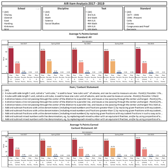
How can I use this? Easy. Start at the top left and select your school, discipline, test and standard. You are diving deep into the weeds by narrowing this much and each selection narrows the options in the next box moving left to right. Below is a sample:
You can see how the students performed (the % of students who received each point value) on each administration (Fall2017, Spring 2018, etc.)
To get a better look, we need to look at the Item / Content Statement. That is below:
Here I selected 3 Items. These are items that are almost identical. They have slight wording differences based on changes in standards(revisions made between years) and different point values(1, 2, 3 or 4). You can't see it in this view, but you will when you are in tableau.
This will allow you to see how students performed on individual items / content statements over time. As a general guideline, most questions are 1 point. Some are 2 points and very few are 3 or 4 points. It would be best to look at the % of students earning 0 points and focusing on the changes in that for each administration.
If you have any questions on how to use this visualization or have questions about the data, please feel free to reach out and we can walk through it together.
email: gregory.kibler@youngstown.k12.oh.us


